Skeleton components in React
- Digital Engineering
- General
Skeleton components in React
This article discusses how one could handle loading dynamic content in a modern web application, by making use of skeleton components or skeleton screens.
Introduction
The speed and responsiveness of an application is also perceived by how you show loading of content to the user. It is common to show a blank screen or a spinner loader to indicate something is loading and the application is waiting for posts, images, etc to display. But those create a sense of slow loading. An alternative can be using Skeleton loaders. Companies like Facebook, Youtube, Linkedin have been using skeleton screens to improve user experience on their platforms.
What is Skeleton component and why should you use it?
A skeleton component is a type of UI element that is the shape of the actual content and is displayed as a placeholder till the actual content is loaded. It can be used for a particular section or for the whole screen, displaying data incrementally as soon as its available.
Advantages
– Skeleton loader looks like the actual content, so users know what content or how much loading time to expect before the content loads and renders
– Although it takes the same amount of time for the data to load, it feels more faster and responsive
How to add Skeleton loader in React
- Render the skeleton component conditionally
- Replace the skeleton component with the actual data as soon as its available
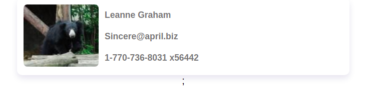
Below is a working example of a simple skeleton component:
The skeleton component itself is simply made of a rectangular shape representing an image and three thin boxes to represent some textual information, achieved through CSS. A shimmer animation is added through keyframes. It is then abstracted into its own SkeletonLoader component.
<SkeletonLoader /> component is imported in the UserCard component and rendered while the data is being fetched from a placeholder API.
When data is available, the actual content is displayed.

Using react-loading-skeleton to create a simple skeleton loader UI
The react-loading-skeleton is a popular npm package to easily create and customize skeleton components.
– Install react-loading-skeleton in your project:
|
1 |
npm install react-loading-skeleton --save |
There is no need to design a skeleton component, the
|
1 2 3 4 5 6 7 8 |
import Skeleton from "react-loading-skeleton"; export default function App() { return ( <div className="App"> <Skeleton /> </div> ); } |
Renders something like this

There are also a few props you can pass to customize the Skeleton component:
count : No need to render individualTheming
You can customize the following properties by wrapping the <Skeleton> component with a <SkeletonTheme> component:
Background color:
Use prop
color to change the background color of the loader
Highlight color:
Use prop
highlightColor to customize the color of the shimmer
Delay: delay before looping the shimmer animation
Duration: duration of one shimmer animation. Default is 1.2(s)
Circle:
If you have to render a circular Skeleton loader, use prop
circle and pass true along with the width and height props to render a round Skeleton component.
You can fiddle with the react-loading-skeleton here:
Conclusion
Skeleton screens are a better alternative to blank screens or spinner loaders as they reduce the perceived loading time and improves the user experience. You can incorporate Skeleton loading screens instead of traditional spinner loaders wherever appropriate. You can create your own Skeleton component UI according to your design, or you can use an existing npm package. It’s not very complex and can be easily incorporated into your project.