Storybook
- User Experience & Design
Storybook
What is a Storybook and How Can I Use it?
Storybook is an open-source JavaScript tool that allows developers to create organized UI systems making both the building process and documentation more efficient and easier to use.
Storybook is a user interface isolated development environment that provides a playground for your components. We can play with our components in different ways without running our main app. We can run the storybook in its port with the setup.
It’s not limited to React. We can use a storybook with most of the frontend frameworks like Vue, Angular, Mithril, Marko, Svelte, etc..,
Setting up Storybook in a Project
Step 1 – Create a react project.
Create a react project with the following command. You can name whatever you like.
|
1 |
npx create-react-app storybook-demo |
Step 2 – Initializing Storybook
Run this inside your existing project’s root directory:
|
1 2 |
#Add Storybook npx sb init |
During its install process, Storybook will look into your project’s dependencies and provide you with the best configuration available.The above command will make the following changes to your local environment:
- 📦 Install the required dependencies.
- 🛠 Setup the necessary scripts to run and build Storybook.
- 🛠 Add the default Storybook configuration.
- 📝 Add some boilerplate stories to get you started.
Step 3 – Starting up Storybook
Storybook will start a new server with port given in the scripts section of package.json file.
|
1 2 3 |
yarn storybook # or npm run storybook |
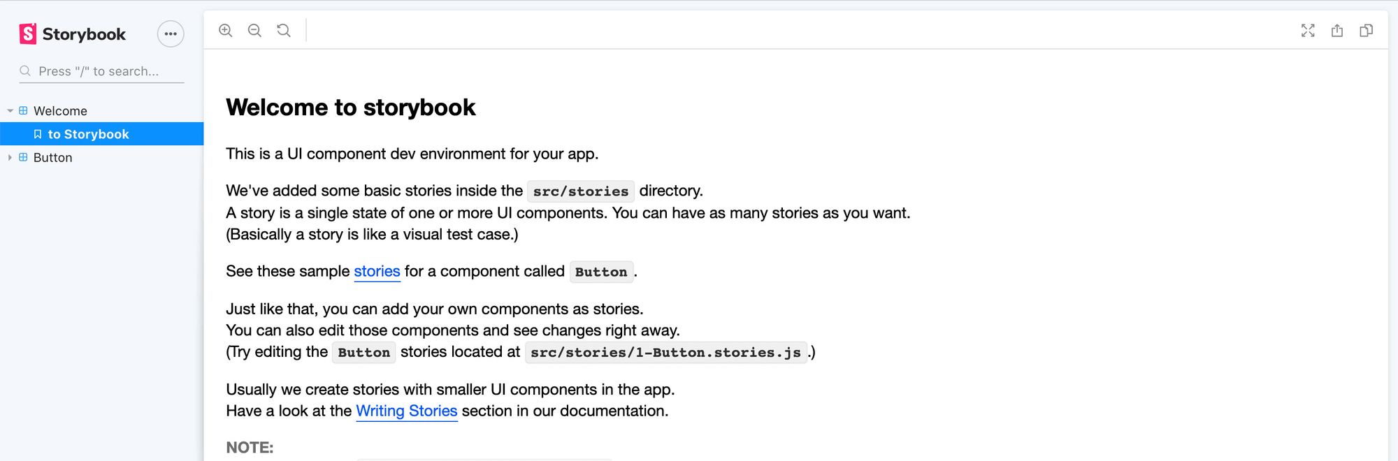
And once everything finishes loading, Storybook will open a new tab in your browser and you should now see a welcome message inside of your new Storybook dashboard!
Storybook uses the concept of stories to document components. So the question arises: what is the story?
What’s a story?
The basic building blocks of Storybook are stories. A story is a function that represents the visual state of the component. Technically a story is a function that returns something that can be rendered to a screen.
The stories are written in Component Story Format (CSF)–an ES6 modules-based standard–for writing component examples.
Developers write multiple stories per component that describe all the “interesting” states a component can support.
Storybook makes it easy to work on one component in one state at a time. When you edit the stories, Storybook will instantly re-render in the browser. No need to manually refresh.
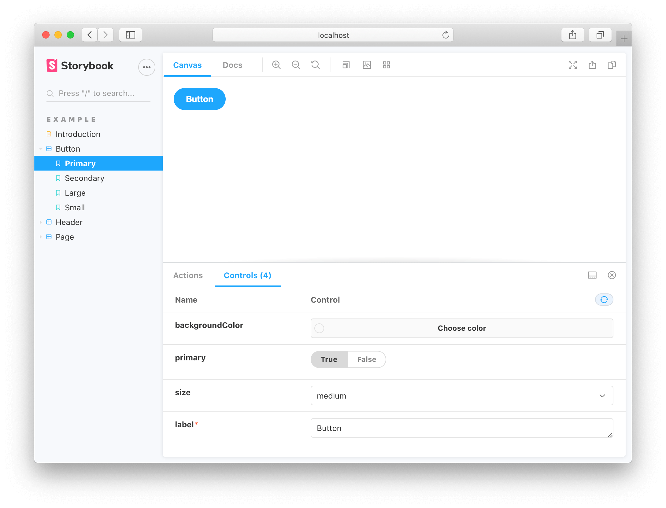
Storybook Addons
Addons are plugins that extend Storybook’s core functionality, we will explore the most useful addons for our development.
- Controls – This allows you to dynamically interact with a component’s args (inputs).
- Actions – Actions are events in JavaScript. It helps you verify interactions produce the correct outputs via callbacks.
For instance, if you view the “Logged In” story of the Header component, we can verify that clicking the “Logout” button triggers the onLogout callback, which would be provided by the component that made use of the Header.
If you click the button, you actually see an Actions and Controls tab at the bottom
- Buttons callbacks are logged into the Actions tab.
- Button’s arguments are dynamically editable in the Controls tab.
Let’s write our first story
In this section, we will write different stories defining different states of our common component Button.
A story defines a state of a component. If you see the props of a component, then you will easily understand different use cases of the component.
|
1 2 3 4 5 6 7 8 9 10 11 12 13 14 15 16 17 18 19 20 21 22 23 24 25 26 27 28 29 30 31 32 33 34 35 36 37 38 39 40 41 42 43 44 45 |
import React from "react"; import { Button } from "./Button"; export default { title: "src/common/Button", }; export const defaultButton = () => ( <Button text="Default Button" onClick={() => {}} /> ); export const largeButton = () => ( <Button text="Large Button" onClick={() => {}} size="large" /> ); export const outlineSmallButton = () => ( <Button text="Outline Small Button" onClick={() => {}} size="small" type="outline" /> ); export const rectangularLargeButton = () => ( <Button text="Rectangular Large Button" onClick={() => {}} size="large" variant="rectangular" /> ); export const disabledButton = () => ( <Button text="Disabled Button" onClick={() => {}} isDisabled={true} /> ); export const warningButton = () => ( <Button text="Disabled Button" onClick={() => {}} backgroundColor="orange" /> ); |
The above three stories define different use cases of our component Button.
Conclusion
Congratulations! You learned the basics. Storybook is the most popular tool for UI component development and documentation. We can write stories for the common components (any UI components) using storybook. And whenever your teammate wants to check the common components of others, then they simply run the storybook server and will see all the UI components there as we have seen above.