Using styled-components in React
- General
Using styled-components in React
In this article , we are going to learn how can we intergrate styled-components in our React Applications .
Overview –
styled-components is the result of wondering how we could enhance CSS for styling React component systems. By focusing on a single use case we managed to optimize the experience for developers as well as the output for end users.
With the advent of modern component-based frontend frameworks, the need to write CSS that is scoped to a particular component has increased. And as with most problems in the frontend sphere, a variety of solutions have sprung up to address it .
Why Styled Components ?
- Simple dynamic styling – adapting the styling of a component based on its props or a global theme is simple and intuitive without having to manually manage dozens of classes.
- Easier deletion of CSS – it can be hard to know whether a class name is used somewhere in your codebase. styled-components makes it obvious, as every bit of styling is tied to a specific component. If the component is unused (which tooling can detect) and gets deleted, all its styles get deleted with it.
- No class name bugs – styled-components generates unique class names for your styles. You never have to worry about duplication, overlap or misspellings.
- Automatic vendor prefixing: write your CSS to the current standard and let styled-components handle the rest.
- Automatic critical CSS: styled-components keeps track of which components are rendered on a page and injects their styles and nothing else, fully automatically. Combined with code splitting, this means your users load the least amount of code necessary.
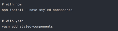
Installation –
To install styled-components you need to run only a single command in your terminal .
Getting Started –
The styled API allows us to create a StyledComponent — a component with styles, as the name implies — by using either a regular HTML element or another StyledComponent as a base.
Let’s take a look at the first method. If we want to make a styled div element and a styled <h1> element into React components, we can simply write:
|
1 2 3 4 5 6 7 8 9 |
import React from "react"; import styled from "styled-components"; const StyledDiv = styled.div` padding: 1.5rem; background-color: skyblue; ` const StyledH1 = styled.h1` color: blue; ` |
And with that, we have two React components that we can now use as regular components:
|
1 2 3 4 5 6 |
function App() { return ( <StyledDiv> <StyledH1>A styled H1 element</StyledH1> </StyledDiv> ); |
Dynamic Styling using React Props –
Another powerful feature of styled-components is its ability to alter a component’s styles using props.
|
1 2 3 4 5 6 7 8 9 10 11 12 13 14 15 16 17 18 |
const Button = styled.button` /* Adapt the colors based on primary prop */ background: ${props => props.primary ? "palevioletred" : "white"}; color: ${props => props.primary ? "white" : "palevioletred"}; font-size: 1em; margin: 1em; padding: 0.25em 1em; border: 2px solid palevioletred; border-radius: 3px; `; render( <div> <Button>Normal</Button> <Button primary>Primary</Button> </div> ); |
Based on the primary prop being passed on or not we are swapping its background and color of the text.
Additional styling methods with the attrs constructor –
styled-components also allows additional props or HTML attributes to be added to a component using the attrs method. Using attrs, we can define static props or attributes like the type of an <input> element as well as dynamic props. Here’s an example of the attrs method in use:
|
1 2 3 4 5 6 7 8 9 10 11 12 13 14 15 16 17 |
const Link = styled.a.attrs((props) => ({ href: props.$to, }))` text-decoration: none; color: #000; border: 1px solid #000; padding: 1rem 1.5rem; border-radius: 5px; `; function App() { return ( <> <Link $to="https://auriait.com">Test link</Link> </> ); } |
In the above code, we attached an href attribute to our <Link> component, whose underlying HTML element was an anchor element. The value passed to the href element was received from the transient prop, $to, of our <Link> component.
Transient props are a feature in styled-components that allow us to use props that will not show up on the DOM. So if you inspect our Link component, you will notice that it was rendered as simply:
|
1 |
<a href="https://aurigait.com" class="sc-bdfBwQ geNjDe">Test link</a> |
Theming React apps with styled-components –
styled-components also supports theming through the use of a ThemeProvider component. We can pass a theme prop to the <ThemeProvider>, and this theme will be passed to all the children of the <ThemeProvider> as a prop.
We can now choose to dynamically style those child components based on the value of the theme prop. Here’s a simple example to show how this works:
|
1 2 3 4 5 6 7 8 9 10 11 12 13 14 15 16 17 18 19 20 21 22 23 24 25 26 27 28 29 30 31 32 33 34 35 36 37 38 39 40 41 42 43 44 45 46 47 48 49 50 51 52 |
const lightTheme = { main: "#fff", }; const darkTheme = { main: "#000", }; const invertColor = (props) => { if (props.theme.main == "#000"){ return "#fff" } else { return "#000" } } const Div = styled.div` padding: 4rem; background-color: ${props => props.theme.main} ` const Button = styled.button` padding: 1.5rem 2rem; color: ${props => invertColor(props)}; border: 1px solid ${props => invertColor(props)}; background-color: ${props => props.theme.main}; transition: all 0.5s; &:hover{ color: ${props => props.theme.main}; background-color: ${props => invertColor(props)}; border: 1px solid ${props => props.theme.main}; } ` /*Default props for the Button component in case it has no theme attached to its props */ Button.defaultProps = { theme: darkTheme } function App() { return ( <> <ThemeProvider theme = {lightTheme}> <Div> <Button>Light Theme button</Button> </Div> </ThemeProvider> <ThemeProvider theme = {darkTheme}> <Div> <Button>Dark Theme button</Button> </Div> <Button>Dark Theme button</Button> </ThemeProvider> </> ); } |
Animations –
CSS animations with @keyframes aren’t scoped to a single component but you still don’t want them to be global to avoid name collisions. This is why we export a keyframes helper which will generate a unique instance that you can use throughout your app:
|
1 2 3 4 5 6 7 8 9 10 11 12 13 14 |
import styled, { keyframes } from 'styled-components' const fadeIn = keyframes` 0% { opacity: 0; } 100% { opacity: 1; } ` const FadeInButton = styled.button` animation: 1s ${fadeIn} ease-out; ` |
Conclusion –
We’ve finally covered what I believe to be the most important and frequently used parts of the styled-components library. You can learn more about the library in the comprehensive documentation here.