Practo
Omega design system for Practo, a platform for quality healthcare
- Product Design
- User Research & Strategy

Practo collaborated with Auriga to enhance its user interface and user experience across their products with the help of design system, which played a pivotal role in transforming Practo’s digital presence.
Overview
Practo is India’s no.1 online doctor consultation app and offer complete telemedicine solutions and deliver medicines. With the largest network of doctors and healthcare providers from top clinics and hospitals, Practo serves users PAN India. Practo has multiple products and they wanted to build a design system to create a single source of truth to guide design decisions, for consistent user experience and to build products better, faster.
Challenges
- Usability and accessibility issues : Since Practo’s initial design principles were not created with accessibility in mind, its different products were somewhat difficult in use, especially with older people.
- Inconsistent Design: There are 6 different products of Practo for customers, doctors, clinics and internal ones. Since there’s no consistency in both their usage and aesthetics, the user experience was becoming fragmented.
- Scaling Issues: As Practo expanded, they struggled to maintain a cohesive UI/UX across various platforms and devices.
How we helped
We studied different established design systems such as Google’s Material, Apple’s Human Interface Guidelines, Shopify’s Polaris and Gojek’s Solv. We understood the fundamentals of components while keeping accessibility in mind.
We chose to implement a component-based design system to streamline our development process and ensure consistency across our digital products. By utilizing reusable components, we can save time and effort in creating and maintaining our user interfaces, allowing us to focus more on enhancing the user experience. This approach also facilitates seamless collaboration between our design and development teams, fostering a more efficient and cohesive workflow.
These are some of the key aspects of our design system :
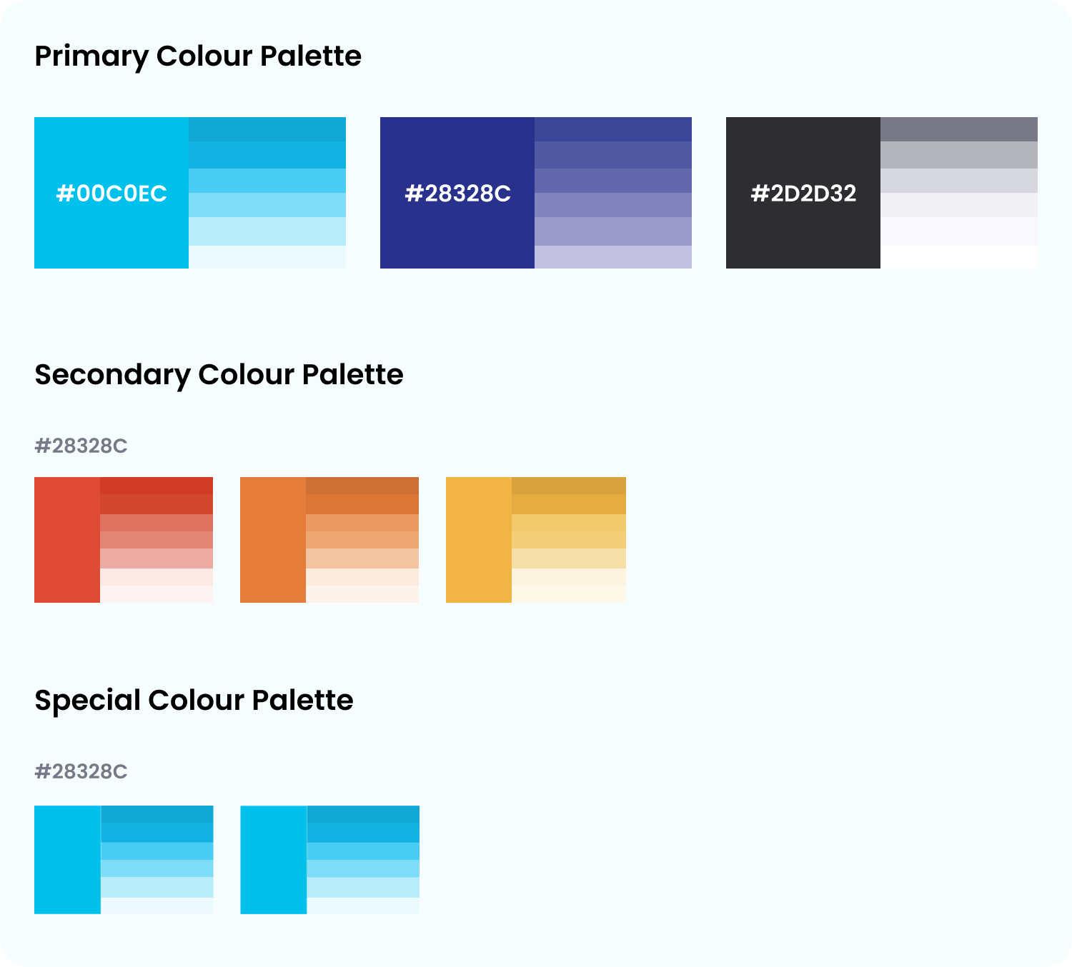
Color
Color in user interface design runs much deeper than simple aesthetics. Clever use of UI colors can help communicate a brand’s message, convey a website’s structure and improve object recognition for better user engagement.
Icon
Icons are simple and informative. Each icon builds on the visual language of the design system, and represents the simplest version of the idea.
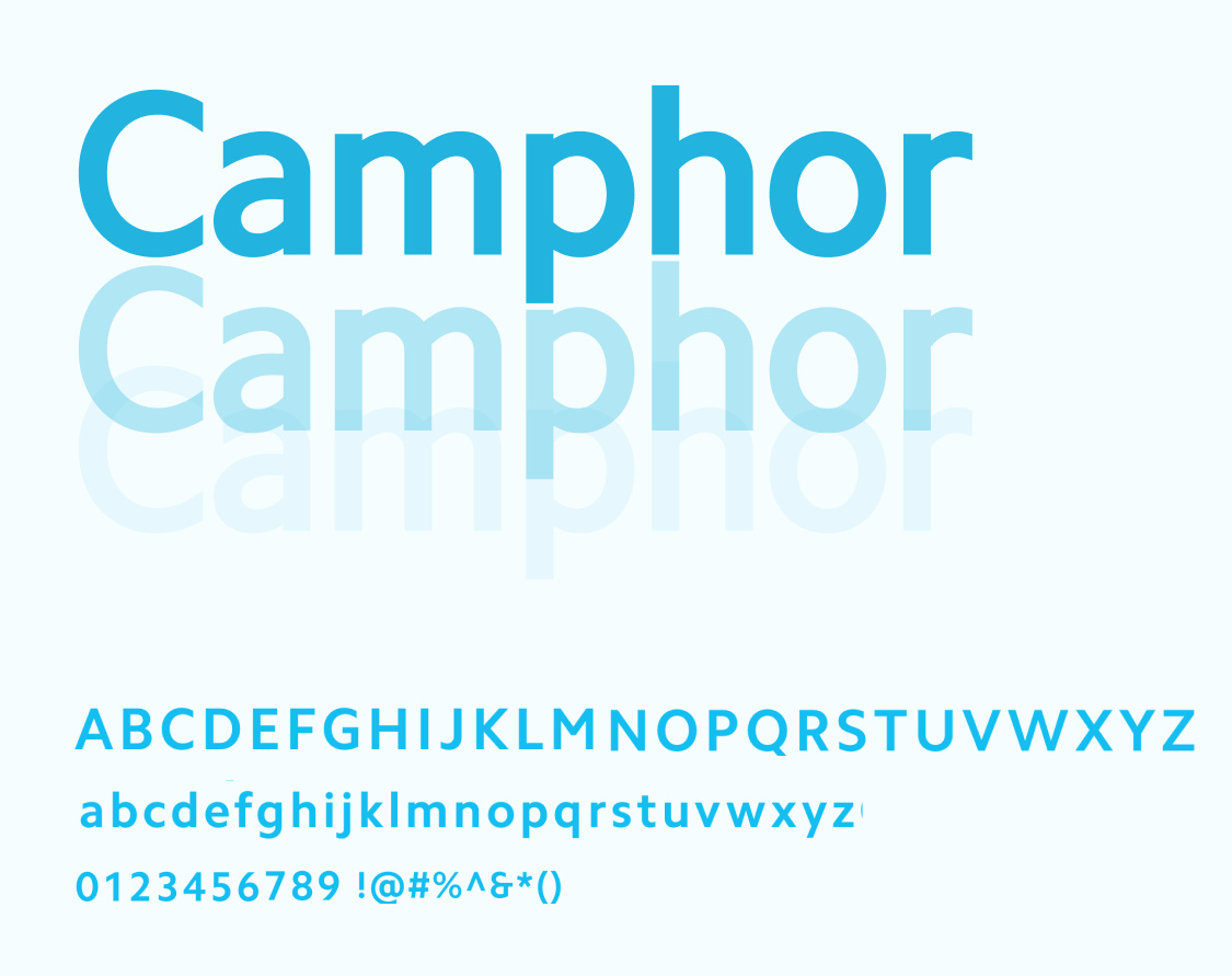
Typography
Practo Design provides a clear and purposeful set of typographic styles. By using consistent typographic styles to appropriate functions in the interface, we create a clear visual pattern for users to follow while they’re interacting with our product.
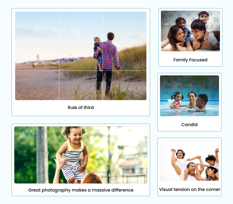
Photography
Family-focused photography with a diversity of age and a consideration to geography is key. Show people outside the healthcare environment whenever possible—healthy, fun activities are our ideal.
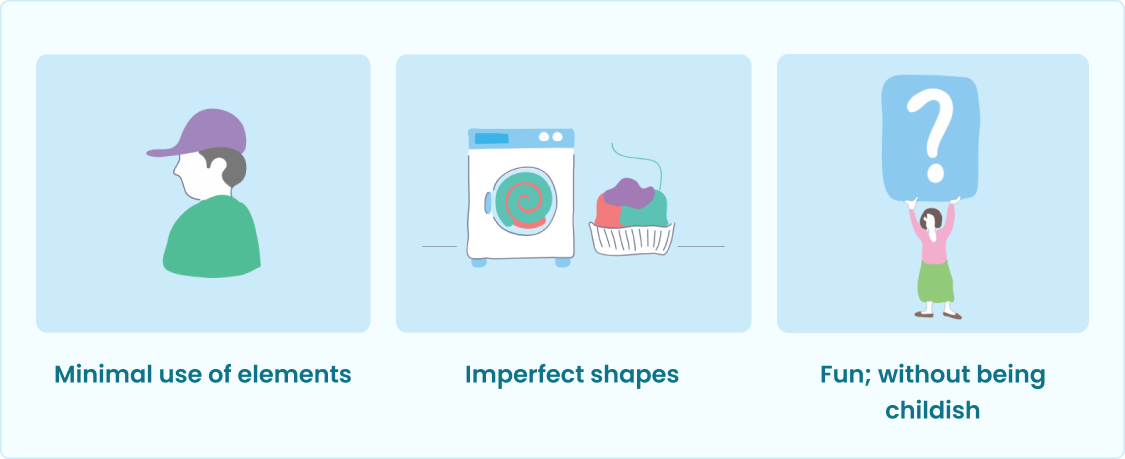
llustration
The concept of ‘Your Home for Health’ necessitates a bold and lively approach, which we achieved through vibrant illustrations capturing the brand’s freshness and warmth. Our non-rigid illustrations feature wavy lines and vibrant colors, exuding a carefree, childlike aura that instills a stress-free atmosphere in healthcare.
Outcomes
- Scalability for future Prospects: The design system implemented is not only a solution for the present but also a blueprint for the future. It is scalable and adaptable for Practo’s continuous product development.
- Improved User Engagement: Practo experienced a notable increase in user engagement across their platforms.
Related Case Studies

SLA Financials

